


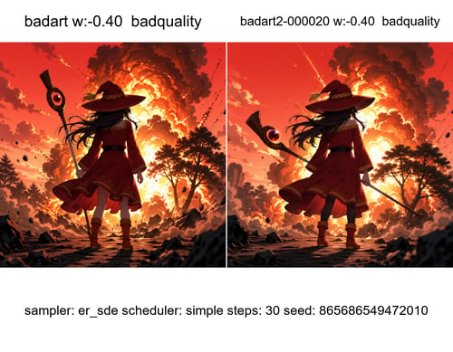
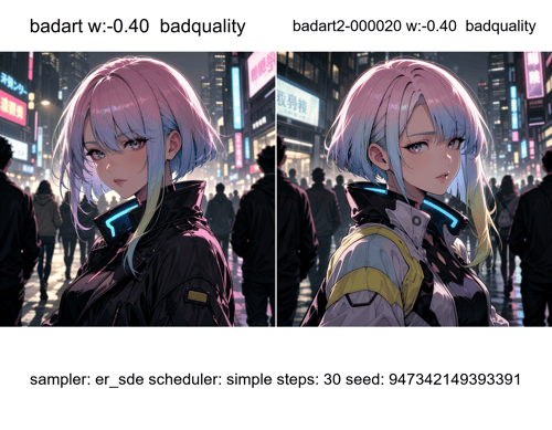
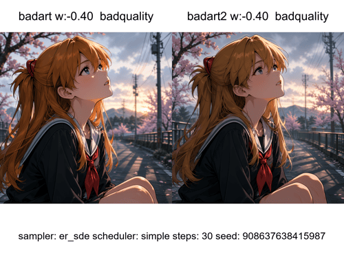
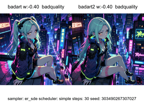
Recommended Weight:
🟢 -0.1 to -0.4
Usage Notes
🟢 -0.1 to -0.4
Best balance between addition details and pose/shot preservation.
Recommended for most generations.
🟡 -0.5 to -0.6
May begin reducing saturation and stylization.
🔴 -0.8 to -1
Can alter the subject, reduce color intensity, or remove desired visual elements
Tips
If using stronger weights, consider adding tags such as "flat color", "simple shading", "saturated colors", or similar style prompts to help maintain color consistency.