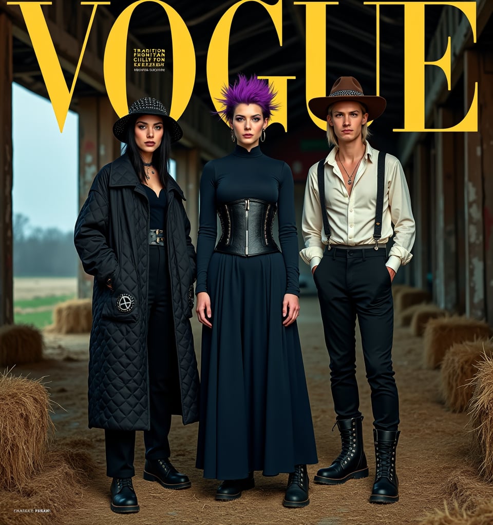
# Amish Punk Magazine Cover Prompt
Create a high-fashion magazine cover showcasing the new "Amish Punk" style:
Layout:
- Vertical format, typical of fashion magazines
- Title at top: "VOGUE" in large, bold typography
- Subtitle: "The Rise of Amish Punk" in smaller, edgy font
Main Image:
- Three models posed in an abandoned barn at twilight
- Fog machine haze for atmospheric effect
- Warm golden lighting with neon pink and green accents
Models and Styling:
1. Center (Modest Mohawk):
- Woman in floor-length navy dress with asymmetrical hem
- Black leather corset over dress
- Detachable bonnet with deep purple mohawk crest
- Combat boots
- Positioned slightly forward, gazing directly at camera
2. Left (Quilted Anarchy):
- Woman in oversized black quilt coat with leather accents
- Coat pattern subtly incorporates anarchist symbols
- Spiked mini-bonnet
- Chunky black boots
- Turned slightly towards center, profile partly visible
3. Right (Barn Raising Rebel):
- Man in black suspender pants with Amish fabric patches
- White button-up with studded collar, sleeves rolled up
- Distressed wide-brimmed hat with studded band
- Dark brown work boots
- Angled towards center, face partially obscured by hat brim
Makeup and Details:
- Minimal base makeup with dramatic eyes
- Subtle neon eyeliner accents (green, pink, blue respectively)
- Focus on texture contrasts: smooth skin, rough leather, soft fabric
Props and Background:
- Visible barn interior with weathered wood and hay bales
- Punk-painted butter churn in foreground
- Modified farm tools (pitchfork with chains) subtly placed
Text Overlays:
- "Tradition Meets Rebellion: Fashion's New Frontier"
- "DIY Punk Meets Amish Simplicity"
- "Modest Mohawks & Quilted Anarchy: Your Guide Inside"
Style and Mood:
- High-contrast, editorial fashion photography
- Blend of rustic textures and sleek, modern elements
- Atmosphere of tension between tradition and defiance
Composition:
- Rule of thirds with models as focal points
- Dynamic poses creating visual interest and flow
- Enough negative space for text without obscuring key style elements